Visual Hierarchy & Layout
Visual hierarchy is the arrangement of elements to show their order of importance. It's what guides a user's eye through your interface in a logical, intuitive way. Every well-designed interface uses visual hierarchy to communicate which elements are most important, which are related, and how content should be consumed.
Master the principles of contrast, size, spacing, and alignment to create clear visual hierarchies. Use larger elements and bolder colors for primary actions, consistent spacing to group related content, and strategic use of white space to reduce cognitive load. The goal is making the interface feel effortless to navigate.
Color Theory & Typography
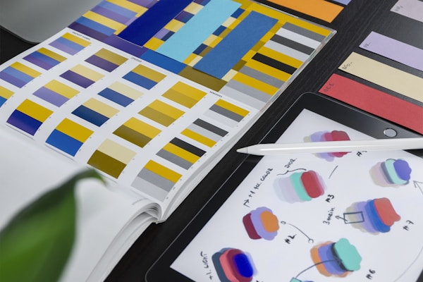
Color and typography are the foundation of visual design. Understanding how colors interact, evoke emotions, and create visual harmony is essential for any developer working on user interfaces. Similarly, typography isn't just about choosing fonts — it's about creating a reading experience that's comfortable and clear.
Use a limited color palette with clear primary, secondary, and accent colors. Ensure sufficient contrast ratios for accessibility (WCAG AA minimum). For typography, establish a clear type scale, maintain consistent line heights and letter spacing, and choose fonts that perform well across all devices and screen sizes.
Responsive & Accessible Design
In 2025, responsive design is table stakes — but true responsive design goes beyond just making things fit on smaller screens. It means creating experiences that feel native and optimized on every device. This requires understanding how users interact differently with mobile, tablet, and desktop interfaces.
Accessibility is equally important and increasingly legally required. Design for screen readers, ensure keyboard navigation works throughout your interface, provide sufficient color contrast, and never rely solely on color to convey information. Accessible design isn't a constraint — it makes your interface better for everyone.
Micro-Interactions & Animation
Micro-interactions are the small, subtle animations that make interfaces feel alive and responsive. Button hover states, loading indicators, page transitions, and feedback animations all contribute to a polished, professional feel. They provide crucial feedback that helps users understand what's happening in the interface.
The key to good micro-interactions is subtlety. Animations should be quick (200-400ms), purposeful, and enhance the user's understanding of what just happened or what's about to happen. Use easing curves that feel natural, and never let animations delay or interfere with user actions.
Design Systems & Consistency
A design system is a collection of reusable components, patterns, and guidelines that ensure consistency across an entire product or organization. In 2025, design systems have become essential tools for both design and development teams working at scale.
Building a design system starts with documenting your existing patterns, identifying inconsistencies, and creating a shared vocabulary between design and development. Include components for every common UI pattern, document usage guidelines and accessibility requirements, and maintain the system as a living document that evolves with your product.
